
Python
Build & Use Sector Rotation Charts for Smarter Investing with Python

FabTrader
Article overview
Learn how to build and interpret sector rotation charts in Python to compare relative strength, spot leadership shifts, and make more informed investing decisions.
In the world of investing and trading, identifying market leaders and laggards is crucial. Traditional price charts and indicators provide valuable insights, but they often fail to visualize sector or stock rotation in a clear and intuitive manner. This is where sector rotation charts come into play.
Sector rotation charts allow traders and investors to compare the relative strength and momentum of multiple securities against a benchmark, revealing how different stocks, sectors, or asset classes are rotating through various performance phases. This article explores how to interpret these charts effectively and use them for making informed investment decisions.
What Is a Sector Rotation Chart?
A sector rotation chart is a visualization tool that plots securities based on two key indicators:
- JdK RS-Ratio (Relative Strength Ratio) – Measures a security’s relative strength against a benchmark. Higher values indicate outperformance, while lower values suggest underperformance.
- JdK RS-Momentum (Relative Strength Momentum) – Measures the rate of change of the relative strength. Increasing momentum suggests improving strength, while decreasing momentum signals weakening performance.
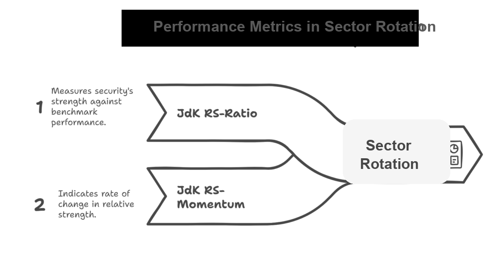
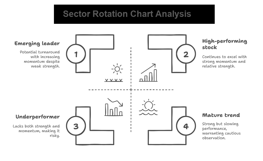
By plotting these values on a two-dimensional plane, the chart naturally divides into four quadrants:
Improving (Look for Buys) – Top-left quadrant
- Securities in this quadrant have weak relative strength but are gaining momentum.
- These are potential turnaround candidates that may soon transition into the leading quadrant.
- Ideal for investors looking for early entry points into emerging leaders.
Leading (Hold) – Top-right quadrant
- Securities in this quadrant have both high relative strength and strong momentum.
- These are the outperformers of the market.
- Typically, stocks or sectors here continue to perform well, making them attractive for holding or further accumulation.
Weakening (Look for Sells) – Bottom-right quadrant
- Securities in this quadrant still have high relative strength but are losing momentum.
- This often indicates a mature uptrend that may be slowing down.
- If a security remains in this quadrant for an extended period, it may transition into the lagging quadrant, signaling a potential exit point.
Lagging (Avoid) – Bottom-left quadrant
- Securities in this quadrant exhibit both weak relative strength and weak momentum.
- These are underperformers that should be avoided or shorted.
- Investors should be cautious about bottom fishing unless there is a clear sign of reversal.
Access this Tool for free on our community site
You can access this tool here
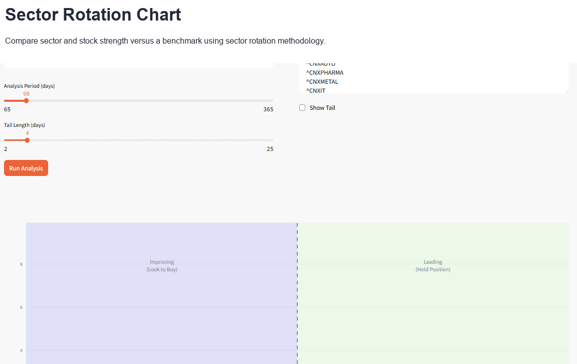
Python Implementation
Following is the Python Streamlit implementation of the sector rotation chart.
import streamlit as st
import yfinance as yf
import pandas as pd
import numpy as np
import plotly.graph_objects as go
import plotly.express as px
from datetime import datetime, timedelta
import warnings
from scipy.interpolate import interp1d

warnings.filterwarnings('ignore')

# Configure page
st.set_page_config(
    page_title="Sector Rotation Analysis",
    layout="centered"
)
# Apply fixed screen width for app (1440px)
st.markdown(
    f"""
    <style>
      .stAppViewContainer .stMain .stMainBlockContainer{{ max-width: 1440px; }}
    </style>
  """,
    unsafe_allow_html=True,
)

def fetch_data(symbols, period_days):
    """Fetch data from Yahoo Finance with error handling"""
    data = {}
    failed_symbols = []

    # Calculate start date
    end_date = datetime.now()
    start_date = end_date - timedelta(days=period_days + 10)  # Add buffer for calculations

    for symbol in symbols:
        try:
            hist = yf.download(symbol, start_date, end_date, multi_level_index=False)

            if len(hist) < 20:  # Minimum data requirement
                failed_symbols.append(symbol)
                continue

            data[symbol] = hist['Close']
        except Exception as e:
            failed_symbols.append(symbol)
            continue

    return data, failed_symbols


def calculate_relative_strength(price_data, benchmark_data, period):
    """Calculate relative strength vs benchmark"""
    # Ensure we have enough data
    min_length = min(len(price_data), len(benchmark_data))
    if min_length < period:
        return None, None

    # Align data by index
    aligned_data = pd.DataFrame({
        'price': price_data,
        'benchmark': benchmark_data
    }).dropna()

    if len(aligned_data) < period:
        return None, None

    # Calculate relative strength (sector/benchmark)
    relative_strength = aligned_data['price'] / aligned_data['benchmark']

    # Calculate momentum (rate of change)
    rs_momentum = relative_strength.pct_change(period).dropna()

    return relative_strength, rs_momentum


def calculate_jdk_rs_ratio(relative_strength, short_period=10, long_period=40):
    """Calculate JdK RS-Ratio similar to sector rotation methodology"""
    if len(relative_strength) < long_period:
        return None

    # Normalize relative strength to 100
    rs_normalized = (relative_strength / relative_strength.rolling(long_period).mean()) * 100

    return rs_normalized


def calculate_jdk_rs_momentum(rs_ratio, period=10):
    """Calculate JdK RS-Momentum"""
    if rs_ratio is None or len(rs_ratio) < period:
        return None

    # Calculate momentum as rate of change
    momentum = ((rs_ratio / rs_ratio.shift(period)) - 1) * 100

    return momentum


def get_quadrant_info(rs_ratio, rs_momentum):
    """Determine quadrant and provide info"""
    if rs_ratio > 100 and rs_momentum > 0:
        return "Leading", "green", "🚀"
    elif rs_ratio > 100 and rs_momentum < 0:
        return "Weakening", "orange", "📉"
    elif rs_ratio < 100 and rs_momentum < 0:
        return "Lagging", "red", "📊"
    else:
        return "Improving", "blue", "📈"


def smooth_data(x_vals, y_vals, method="Moving Average", window=3):
    """Smooth the tail data using various methods"""
    if len(x_vals) < 3 or len(y_vals) < 3:
        return x_vals, y_vals

    try:
        if method == "Moving Average":
            # Simple moving average
            x_smooth = pd.Series(x_vals).rolling(window=window, center=True, min_periods=1).mean().values
            y_smooth = pd.Series(y_vals).rolling(window=window, center=True, min_periods=1).mean().values

        elif method == "Exponential":
            # Exponential smoothing
            alpha = 2.0 / (window + 1)
            x_smooth = pd.Series(x_vals).ewm(alpha=alpha, adjust=False).mean().values
            y_smooth = pd.Series(y_vals).ewm(alpha=alpha, adjust=False).mean().values

        elif method == "Spline":
            # Spline interpolation for smoothing
            if len(x_vals) >= 4:  # Need at least 4 points for cubic spline
                indices = np.arange(len(x_vals))

                # Create more points for smoother curve
                new_indices = np.linspace(0, len(x_vals) - 1, len(x_vals) * 2)

                # Interpolate
                f_x = interp1d(indices, x_vals, kind='cubic', bounds_error=False, fill_value='extrapolate')
                f_y = interp1d(indices, y_vals, kind='cubic', bounds_error=False, fill_value='extrapolate')

                x_smooth = f_x(new_indices)
                y_smooth = f_y(new_indices)

                # Sample back to original length but smoothed
                sample_indices = np.linspace(0, len(x_smooth) - 1, len(x_vals)).astype(int)
                x_smooth = x_smooth[sample_indices]
                y_smooth = y_smooth[sample_indices]
            else:
                # Fall back to moving average for short series
                x_smooth = pd.Series(x_vals).rolling(window=2, center=True, min_periods=1).mean().values
                y_smooth = pd.Series(y_vals).rolling(window=2, center=True, min_periods=1).mean().values

        return x_smooth, y_smooth

    except Exception as e:
        # If smoothing fails, return original data
        return x_vals, y_vals


def create_sector_rotation_plot(results, tail_length, enable_smoothing=True, smoothing_method="Moving Average",
                    smoothing_window=3, show_tail=False):
    """Create the sector rotation chart"""
    fig = go.Figure()

    # First, determine the actual data ranges
    all_rs_ratios = []
    all_rs_momentum = []

    for symbol, data in results.items():
        if data['rs_ratio'] is not None and data['rs_momentum'] is not None:
            rs_ratio_vals = data['rs_ratio'].dropna().values
            rs_momentum_vals = data['rs_momentum'].dropna().values
            if len(rs_ratio_vals) > 0 and len(rs_momentum_vals) > 0:
                all_rs_ratios.extend(rs_ratio_vals)
                all_rs_momentum.extend(rs_momentum_vals)

    if not all_rs_ratios or not all_rs_momentum:
        st.error("No valid data to plot")
        return None

    # Calculate dynamic ranges with some padding
    x_min, x_max = min(all_rs_ratios), max(all_rs_ratios)
    y_min, y_max = min(all_rs_momentum), max(all_rs_momentum)

    # Add padding (10% on each side)
    x_padding = (x_max - x_min) * 0.1
    y_padding = (y_max - y_min) * 0.1

    x_range = [x_min - x_padding, x_max + x_padding]
    y_range = [y_min - y_padding, y_max + y_padding]

    # Ensure 100 is visible on x-axis and 0 is visible on y-axis
    x_center = 100
    x_data_range = max(x_max - 100, 100 - x_min)  # Get the larger distance from 100
    x_range = [x_center - x_data_range - x_padding, x_center + x_data_range + x_padding]
    if y_range[0] > 0:
        y_range[0] = min(y_range[0], -0.5)
    if y_range[1] < 0:
        y_range[1] = max(y_range[1], 0.5)

    # Add quadrant backgrounds based on actual ranges
    fig.add_shape(
        type="rect",
        x0=100, y0=0, x1=x_range[1], y1=y_range[1],
        fillcolor="rgba(0,255,0,0.1)",
        line=dict(color="rgba(0,0,0,0)"),
        name="Leading"
    )
    fig.add_shape(
        type="rect",
        x0=100, y0=y_range[0], x1=x_range[1], y1=0,
        fillcolor="rgba(255,165,0,0.1)",
        line=dict(color="rgba(0,0,0,0)"),
        name="Weakening"
    )
    fig.add_shape(
        type="rect",
        x0=x_range[0], y0=y_range[0], x1=100, y1=0,
        fillcolor="rgba(255,0,0,0.1)",
        line=dict(color="rgba(0,0,0,0)"),
        name="Lagging"
    )
    fig.add_shape(
        type="rect",
        x0=x_range[0], y0=0, x1=100, y1=y_range[1],
        fillcolor="rgba(0,0,255,0.1)",
        line=dict(color="rgba(0,0,0,0)"),
        name="Improving"
    )

    # Add center lines
    fig.add_hline(y=0, line_dash="dash", line_color="black", opacity=0.5)
    fig.add_vline(x=100, line_dash="dash", line_color="black", opacity=0.5)

    colors = px.colors.qualitative.Set2

    for i, (symbol, data) in enumerate(results.items()):
        if data['rs_ratio'] is None or data['rs_momentum'] is None:
            continue

        rs_ratio = data['rs_ratio'].dropna()
        rs_momentum = data['rs_momentum'].dropna()

        # Get the last 'tail_length' points
        tail_points = min(tail_length, len(rs_ratio))

        if tail_points < 2:
            continue

        x_vals = rs_ratio.tail(tail_points).values
        y_vals = rs_momentum.tail(tail_points).values

        # Apply smoothing if enabled
        if enable_smoothing and tail_points > 2:
            x_vals_smooth, y_vals_smooth = smooth_data(x_vals, y_vals, smoothing_method, smoothing_window)
        else:
            x_vals_smooth, y_vals_smooth = x_vals, y_vals

        color = colors[i % len(colors)]

        # Add tail (trajectory) - use smoothed data for the line, original for markers
        if show_tail:
            fig.add_trace(go.Scatter(
                x=x_vals_smooth,
                y=y_vals_smooth,
                mode='lines',
                name=f'{symbol} Trail',
                line=dict(color=color, width=3, shape='spline' if smoothing_method == "Spline" else 'linear'),
                opacity=0.7,
                showlegend=False
            ))

        # Add small markers along the trail (using original data)
        if not enable_smoothing or len(x_vals) <= 5:
            # Show more markers when not smoothing or short tail
            marker_step = max(1, len(x_vals) // 8)
        else:
            # Fewer markers when smoothing for cleaner look
            marker_step = max(2, len(x_vals) // 5)

        # Add current position (larger marker) - always use original data
        current_quad, quad_color, quad_icon = get_quadrant_info(x_vals[-1], y_vals[-1])

        fig.add_trace(go.Scatter(
            x=[x_vals[-1]],
            y=[y_vals[-1]],
            mode='markers+text',
            name=f'{symbol} ({current_quad})',
            marker=dict(
                size=20,
                color=color,
                line=dict(width=2, color='white')
            ),
            text=[f'{symbol}'],
            textposition="middle right",
            textfont=dict(size=15, color='black'),
            hovertemplate=f'<b>{symbol}</b><br>' +
                          f'RS-Ratio: {x_vals[-1]:.2f}<br>' +
                          f'RS-Momentum: {y_vals[-1]:.2f}<br>' +
                          f'Quadrant: {current_quad}<extra></extra>'
        ))

    # Update layout
    fig.update_layout(
        xaxis_title="RS-Ratio",
        yaxis_title="RS-Momentum",
        width=800,
        height=1000,
        showlegend=False,
        legend=dict(
            orientation="v",
            yanchor="top",
            y=1,
            xanchor="left",
            x=1.01
        )
    )

    # Set dynamic axis ranges
    fig.update_xaxes(range=x_range)
    fig.update_yaxes(range=y_range)

    # Add annotations for quadrants - position them based on actual ranges
    x_mid = (x_range[0] + x_range[1]) / 2
    y_mid = (y_range[0] + y_range[1]) / 2

    # Leading quadrant (top-right)
    leading_x = (100 + x_range[1]) / 2
    leading_y = y_range[1] * 0.8
    fig.add_annotation(x=leading_x, y=leading_y, text="Leading<br>(Hold Position)",
                       # showarrow=False, font=dict(size=14, color="green"))
                       showarrow=False, font=dict(size=14))

    # Weakening quadrant (bottom-right)
    weakening_x = (100 + x_range[1]) / 2
    weakening_y = y_range[0] * 0.8
    fig.add_annotation(x=weakening_x, y=weakening_y, text="Weakening<br>(Look to Sell)",
                       # showarrow=False, font=dict(size=14, color="orange"))
                       showarrow=False, font=dict(size=14))

    # Lagging quadrant (bottom-left)
    lagging_x = (x_range[0] + 100) / 2
    lagging_y = y_range[0] * 0.8
    fig.add_annotation(x=lagging_x, y=lagging_y, text="Lagging<br>(Avoid)",
                       # showarrow=False, font=dict(size=14, color="red"))
                       showarrow=False, font=dict(size=14))

    # Improving quadrant (top-left)
    improving_x = (x_range[0] + 100) / 2
    improving_y = y_range[1] * 0.8
    fig.add_annotation(x=improving_x, y=improving_y, text="Improving<br>(Look to Buy)",
                       # showarrow=False, font=dict(size=14, color="blue"))
                       showarrow=False, font=dict(size=14))

    return fig


def main():

    st.subheader("Sector Rotation Chart")
    st.markdown(
        "Analyze sector/stock performance relative to benchmark using sector rotation methodology. Input symbols as seen in Yahoo Finance")

    col1, col2 = st.columns([1, 1], gap="large")
    with col1:
        # Benchmark input
        benchmark = st.text_input("Benchmark Symbol", value="^NSEI",
                                  help="Enter benchmark symbol (e.g., ^NSEI for Nifty 50)")

        st.markdown("<style> .st-bu { background-color: rgba(0, 0, 0, 0); } </style>", unsafe_allow_html=True)

        # Period slider
        period = st.slider("Analysis Period (days)", min_value=65, max_value=365, value=90, step=5)

        # Tail length slider
        tail_length = st.slider("Tail Length (days)", min_value=2, max_value=25, value=4, step=1)

    with col2:
        # Sectors input
        default_sectors = ["^CNXAUTO", "^CNXPHARMA", "^CNXMETAL", "^CNXIT", "^CNXENERGY", "^CNXREALTY", "^CNXPSUBANK",
                           "^CNXMEDIA", "^CNXINFRA", "^CNXPSE", "RELIANCE.NS", "INFY.NS"]

        sectors_text = st.text_area(
            "Enter Sector/Stock symbols (one per line)",
            value="\n".join(default_sectors),
            height=220,
            help="Enter each sector/stock symbol on a new line"
        )

        sectors = [s.strip() for s in sectors_text.split('\n') if s.strip()]

        show_tail = st.checkbox(label="Show Tail", value=False)

    # Analysis button
    if st.button("Run Analysis", type="primary"):
        if not sectors:
            st.error("Please enter at least one sector symbol")
            return

        with st.spinner("Fetching data and calculating metrics..."):
            # Fetch benchmark data
            benchmark_data, benchmark_failed = fetch_data([benchmark], period)

            if benchmark not in benchmark_data:
                st.error(f"Could not fetch data for benchmark: {benchmark}")
                return

            # Fetch sector data
            sector_data, failed_sectors = fetch_data(sectors, period)

            if not sector_data:
                st.error("Could not fetch data for any sectors")
                return

            # Show warnings for failed symbols
            if failed_sectors:
                st.warning(f"Could not fetch data for: {', '.join(failed_sectors)}")

            # Calculate relative rotation metrics
            results = {}
            benchmark_prices = benchmark_data[benchmark]

            for symbol, prices in sector_data.items():
                try:
                    # Calculate relative strength
                    rel_strength, rel_momentum = calculate_relative_strength(prices, benchmark_prices, 10)

                    if rel_strength is not None:
                        # Calculate JdK RS-Ratio and RS-Momentum
                        rs_ratio = calculate_jdk_rs_ratio(rel_strength)
                        rs_momentum = calculate_jdk_rs_momentum(rs_ratio)

                        results[symbol] = {
                            'rs_ratio': rs_ratio,
                            'rs_momentum': rs_momentum,
                            'relative_strength': rel_strength
                        }

                except Exception as e:
                    st.warning(f"Error calculating metrics for {symbol}: {str(e)}")
                    continue

            if not results:
                st.error("Could not calculate metrics for any sectors")
                return

            # Create and display the plot
            fig = create_sector_rotation_plot(results, tail_length, show_tail)
            st.plotly_chart(fig, use_container_width=True)

            # Summary table
            st.subheader("Relative Positions of Sector/Stock")
            summary_data = []

            for symbol, data in results.items():
                if data['rs_ratio'] is not None and data['rs_momentum'] is not None:
                    current_ratio = data['rs_ratio'].iloc[-1] if len(data['rs_ratio']) > 0 else 0
                    current_momentum = data['rs_momentum'].iloc[-1] if len(data['rs_momentum']) > 0 else 0

                    quadrant, color, icon = get_quadrant_info(current_ratio, current_momentum)

                    summary_data.append({
                        'Sector': symbol,
                        'RS-Ratio': f"{current_ratio:.2f}",
                        'RS-Momentum': f"{current_momentum:.2f}",
                        'Quadrant': f"{quadrant}"
                    })

            if summary_data:
                df_summary = pd.DataFrame(summary_data)
                st.dataframe(df_summary, use_container_width=True, hide_index=True)

            # Explanation
            with st.expander("Understanding the Sector Rotation Chart"):
                st.markdown("""
                    **Quadrants Explanation:**

                    **Leading (Top-Right)**: High relative strength, positive momentum
                    - Sectors out performing benchmark with increasing momentum

                    **Weakening (Bottom-Right)**: High relative strength, negative momentum
                    - Sectors still out performing but losing momentum

                    **Lagging (Bottom-Left)**: Low relative strength, negative momentum
                    - Sectors under performing benchmark with decreasing momentum

                    **Improving (Top-Left)**: Low relative strength, positive momentum
                    - Sectors under performing but gaining momentum

                    **How to Read:**
                    - **RS-Ratio > 100**: Sector out performing benchmark
                    - **RS-Ratio < 100**: Sector under performing benchmark
                    - **RS-Momentum > 0**: Relative strength is improving
                    - **RS-Momentum < 0**: Relative strength is declining
                    - **Tail**: Shows the trajectory of sector movement over time
                    """)


if __name__ == "__main__":
    main()
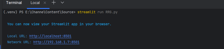
How to run this streamlit script
How to Interpret Sector Rotation Patterns
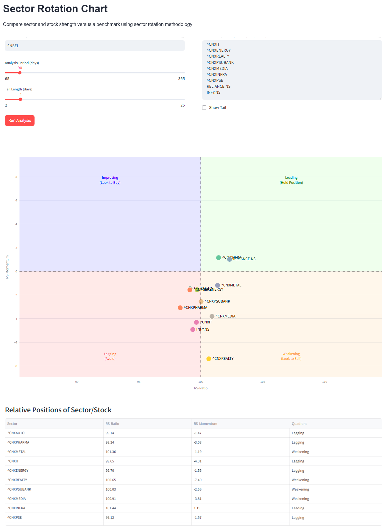
Sector rotation charts provide more than just a snapshot; they also illustrate how securities rotate through different phases over time. By analyzing the tail movement, investors can gain deeper insights into market dynamics.
- Clockwise Rotation – The most common pattern
- Securities tend to move from improving → leading → weakening → lagging in a clockwise fashion.
- This rotation aligns with market cycles and sector rotation.
- Sharp Turns in Momentum
- A sudden move from lagging to improving suggests a strong reversal.
- Conversely, a sharp drop from leading to weakening may indicate an overbought condition.
- Length of the Tail
- A long tail signifies high volatility and strong trends.
- A short tail suggests stability but slower movement.
- Securities Crossing Quadrants
- Stocks moving from improving to leading are prime buy candidates.
- Stocks moving from weakening to lagging should be avoided.
Practical Applications of Sector Rotation Charts
- Sector Rotation Strategy
- Investors can use sector rotation charts to identify which sectors are gaining strength and allocate capital accordingly.
- For example, if technology is moving from improving to leading, it may be a good time to increase exposure to tech stocks.
- Stock Selection
- Sector rotation charts help traders focus on stocks with strong relative performance rather than just absolute price movements.
- Portfolio Diversification
- By identifying sector rotations, investors can balance their portfolios across leading and improving sectors.
- Market Timing
- Watching how securities rotate through quadrants helps investors time their entries and exits more effectively.
Limitations of Sector Rotation Charts
While sector rotation charts are powerful tools, they should not be used in isolation. Here are a few things to keep in mind:
- Lagging Indicator – Since it relies on historical data, a sector rotation chart may not always predict sudden market reversals.
- Works Best for Groups – It is most effective when comparing multiple securities rather than analyzing a single stock.
- Needs Confirmation – Combining sector rotation charts with other technical indicators like moving averages, RSI, or MACD can improve accuracy.
Conclusion
Sector rotation charts provide a dynamic and insightful way to analyze market trends and rotation across sectors. By understanding the four quadrants and monitoring rotation patterns, traders and investors can make better-informed decisions about which stocks or sectors to buy, hold, or avoid.
Whether you're a short-term trader or a long-term investor, integrating sector rotation charts into your strategy can offer a big-picture view of market trends, helping you stay ahead of the curve.
More from Python
Finding the Most Liquid Equity ETFs in each Category using Python
Not all ETFs are created equal — especially when it comes to liquidity. While NSE provides a full ETF list, identifying the...
The Market’s Coiled Spring — Building the Momentum Squeeze Indicator in Python
Volatility doesn’t expand randomly — it contracts first. The Momentum Squeeze Indicator, popularized by LazyBear, is built on this simple but powerful...
Price Consolidation Boxes: Ranges, Breakouts, and Retests Using Python
Markets don’t trend most of the time — they pause, compress, and consolidate. Before every meaningful move up or down, price typically...