
Heatmaps are one of the most powerful ways to quickly understand stock market performance at a glance. In this blog, we’ll build a NSE Nifty Indices Heatmap Dashboard using Python, Streamlit and Plotly to visualize the performance of key Indian stock indices such as:
- Nifty 50, Nifty Next 50, Nifty Midcap 50, Nifty Bank, Nifty Auto, Nifty IT, etc The full exhaustive list of indices can be accessed via the drop down input provided.
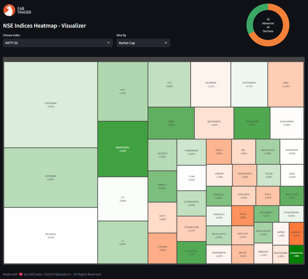
The dashboard lets you slice data by Market Cap, Gainers, or Losers, offering a flexible and insightful way to track market movements.
What is a Heatmap?
A heatmap is a data visualization technique that uses color gradients to represent different values. In stock market analysis, heatmaps are commonly used to show how a group of stocks are performing relative to each other, making them great for spotting:
- Sector or index-wide trends
- Top-performing or underperforming stocks
- Capital flow (via market cap visualization)
With a treemap-style heatmap, the size and color of each block reflect important metrics like price change and market capitalization.
Python Dependencies
Before we dive into the code, make sure the following libraries are installed:
pip install streamlit plotly pandas
streamlit – To build an interactive web app
plotly – For plotting rich, interactive treemaps
pandas – For working with structured tabular data
How It Works
This dashboard works in three steps:
1️⃣ Define Indices and Constituents
We manually map index names to their stock symbols (as per NSE). This lets us fetch price data for all stocks in a given index.
2️⃣ Fetch Market Data
Using NSEIndia website, we pull current price, previous close, market cap, and compute % change for each stock.
3️⃣ Generate Treemap
We use plotly.express.treemap() to create a visual representation based on the selected slicing method:
❌ Top Losers → Filter stocks with negative change
📈 Market Cap → Size by market cap, color by % change
✅ Top Gainers → Filter stocks with positive change
How to Use
Run the app:
streamlit run heatmap_dashboard.py
- Select an index from the dropdown
- Choose how to slice the data:
- Market Cap (for size & weight comparison)
- Gainers (to see who’s leading the rally)
- Losers (to identify weakness)
- Explore the visual output. Each box shows:
- Symbol
- Current price
- % Change
The color gradient shows the magnitude of gain/loss while the box size shows relative importance (market cap or % change).
Full Python Code of the Visualizer
"""
Indices Heatmap Visualizer

-- Dependencies to be installed --
pip install streamlit
pip install pandas
pip install matplotlib

Disclaimer:
The information provided is for educational and informational purposes only and
should not be construed as financial, investment, or legal advice. The content is based on publicly available
information and personal opinions and may not be suitable for all investors. Investing involves risks,
including the loss of principal.

Queries on feedback on the python screener can be sent to :
FabTrader (fabtraderinc@gmail.com)
www.fabtrader.in
YouTube: @fabtraderinc
X / Instagram / Telegram :  @Iamfabtrader
"""
from logging import exception

import streamlit as st
import pandas as pd
import plotly.express as px
import requests


@st.cache_data(ttl=300)
def get_index_details(category):
    """
    Function that returns constituents and price change / mcap data for indices
    :param category: Index
    :return: Dataframe containing Price Change and Market Cap data for all index constituents
    """

    headers = {
        'User-Agent': 'Mozilla/5.0 (Windows NT 10.0; Win64; x64) AppleWebKit/537.36 (KHTML, like Gecko) Chrome/85.0.4183.83 Safari/537.36',
        'Upgrade-Insecure-Requests': "1",
        "DNT": "1",
        "Accept": "text/html,application/xhtml+xml,application/xml;q=0.9,*/*,q=0.8",
        'Accept-Language': 'en-US,en;q=0.9',
        'Accept-Encoding': 'gzip, deflate',
        'Connection': 'keep-alive'
    }
    category = category.upper().replace('&', '%26').replace(' ', '%20')

    try:
        ref_url = "https://www.nseindia.com/market-data/live-equity-market?symbol={category}"
        ref = requests.get(ref_url, headers=headers)
        url = f"https://www.nseindia.com/api/equity-stockIndices?index={category}"
        data = requests.get(url, headers=headers, cookies=ref.cookies.get_dict()).json()
        df = pd.DataFrame(data['data'])
        if not df.empty:
            df = df.drop(["meta"], axis=1)
            df = df.set_index("symbol", drop=True)
            df['ffmc'] = round(df['ffmc']/10000000, 0)
            df = df.iloc[1:].reset_index(drop=False)
        return df
    except Exception as e:
        print("Error Fetching Index Data from NSE. Aborting....")
        return pd.DataFrame()

# Include any additional NSE indices to list below
index_list = ['NIFTY 50', 'NIFTY NEXT 50', 'NIFTY MIDCAP 50', 'NIFTY MIDCAP 100', 'NIFTY MIDCAP 150',
                      'NIFTY SMALLCAP 50',
                      'NIFTY SMALLCAP 100', 'NIFTY SMALLCAP 250', 'NIFTY MIDSMALLCAP 400', 'NIFTY 100', 'NIFTY 200',
                      'NIFTY AUTO',
                      'NIFTY BANK', 'NIFTY ENERGY', 'NIFTY FINANCIAL SERVICES', 'NIFTY FINANCIAL SERVICES 25/50',
                      'NIFTY FMCG',
                      'NIFTY IT', 'NIFTY MEDIA', 'NIFTY METAL', 'NIFTY PHARMA', 'NIFTY PSU BANK', 'NIFTY REALTY',
                      'NIFTY PRIVATE BANK', 'Securities in F&O', 'Permitted to Trade',
                      'NIFTY DIVIDEND OPPORTUNITIES 50',
                      'NIFTY50 VALUE 20', 'NIFTY100 QUALITY 30', 'NIFTY50 EQUAL WEIGHT', 'NIFTY100 EQUAL WEIGHT',
                      'NIFTY100 LOW VOLATILITY 30', 'NIFTY ALPHA 50', 'NIFTY200 QUALITY 30',
                      'NIFTY ALPHA LOW-VOLATILITY 30',
                      'NIFTY200 MOMENTUM 30', 'NIFTY COMMODITIES', 'NIFTY INDIA CONSUMPTION', 'NIFTY CPSE',
                      'NIFTY INFRASTRUCTURE',
                      'NIFTY MNC', 'NIFTY GROWTH SECTORS 15', 'NIFTY PSE', 'NIFTY SERVICES SECTOR',
                      'NIFTY100 LIQUID 15',
                      'NIFTY MIDCAP LIQUID 15']


pd.set_option("display.max_rows", None, "display.max_columns", None)

# Set initial page configuration for app
st.set_page_config(
    page_title='FabTrader - Algo Trading : Market Analytics Dashboard',
    layout="centered")

# Apply fixed screen width for app (1440px)
st.markdown(
    f"""
    <style>
      .stAppViewContainer .stMain .stMainBlockContainer{{ max-width: 1440px; }}
    </style>
  """,
    unsafe_allow_html=True,
)

# Streamlit App


header1, header2 = st.columns([3,1])
with header1:
# with st.container():
    st.image("https://fabtrader.in/wp-content/uploads/2025/05/appLogo.png")
    st.subheader("NSE Indices Heatmap - Visualizer")
    col1, col2, _ = st.columns([2,1,1])
    index_filter = col1.selectbox("Choose Index", index_list, index=0)
    slice_by = col2.selectbox("Slice By", ["Market Cap","Gainers","Losers"], index=0)

with header2:
    df = get_index_details(index_filter)
    advances = df[df['pChange'] > 0].shape[0]
    declines = df[df['pChange'] < 0].shape[0]
    no_change = df[df['pChange'] == 0].shape[0]
    total_count = advances + declines + no_change

    # Plot pie chart

    fig = px.pie(names=['Advances','Declines','No Change'],
                 values=[advances, declines, no_change],
                 color=['Advances','Declines','No Change'],
                 # color_discrete_sequence=['#2ecc71', '#e74c3c', '#95a5a6'])
                 color_discrete_sequence=['#3AA864', '#F38039', '#F2F2F2'])
    fig.update_traces(hole=0.7)
    fig.update_traces(textinfo='none')
    fig.update_layout(
        width=200,  # width in pixels
        height=200,  # height in pixels
        showlegend=False,
        annotations=[dict(
            text=f'{advances}<br>Advances<br>{declines}<br>Declines',  # Line break for style
            x=0.5, y=0.5, font_size=14, showarrow=False
        )]
    )
    fig.update_layout(
        margin=dict(l=0, r=0, t=0, b=0)  # left, right, top, bottom
    )
    st.plotly_chart(fig)


if not df.empty:

    if slice_by == 'Market Cap':
        slice_factor = 'ffmc'
        color_scale = ['#ff7a3a', 'white', 'green']
    elif slice_by == 'Gainers':
        slice_factor = 'pChange'
        color_scale = ['white', '#a5eb79']
    elif slice_by == 'Losers':
        df = df[df["pChange"] < 0]
        df['Abs'] = df['pChange'].abs()
        slice_factor = 'Abs'
        color_scale = ['#ff7a3a', 'white']

    # Plotly Treemap
    st.divider()
    fig = px.treemap(
        df,
        path=['symbol'],
        values=slice_factor,
        color='pChange',
        color_continuous_scale=color_scale,
        custom_data=['pChange']
    )
    fig.update_layout(
        margin=dict(t=30, l=0, r=0, b=0),
        width=500,height=1000,
        paper_bgcolor="rgba(0, 0, 0, 0)", plot_bgcolor="rgba(0, 0, 0, 0)",
        )

    fig.update_traces(
        hovertemplate='<b>%{label}</b><br>Size: %{value}<br>pChange: %{customdata[0]:.2f}%',
        texttemplate='%{label}<br>%{customdata[0]:.2f}%',
        textposition='middle center'
    )
    fig.update_traces(textinfo="label+value")
    fig.update_coloraxes(showscale=False)
    st.plotly_chart(fig, use_container_width=True)

else:
    st.warning("Failed to fetch data.")
st.write("")
st.write(":gray[Made with :heart: by FabTrader. ©2024 Fabtrader.in - All Rights Reserved]")
Why Use This Tool?
✅ Visualize real-time market sentiment
✅ Compare stocks within an index
✅ Track market breadth (e.g., how many are green/red)
✅ Spot momentum or weakness instantly
Whether you’re a trader, investor, or market analyst, this dashboard is a powerful addition to your toolkit.
Final Thoughts
This project combines Python’s power with finance data to create a smart and elegant visual tool. You can extend it further by:
- Adding more indices (e.g., sectoral indices)
- Saving daily snapshots
- Adding filters by industry or stock category
- Showing historical performance or trend lines
If you liked this project, check out FabTrader.in for more Python + Finance tools, personal finance resources, and algo trading strategies.
Support this community : FabTrader.in is a one-person initiative dedicated to helping individuals on their F.I.R.E. journey. Running and maintaining this community takes time, effort, and resources. If you’ve found value in the content, consider making a donation to support this mission.
Disclaimer: The information provided in this article is for educational and informational purposes only and should not be construed as financial, investment, or legal advice. The content is based on publicly available information and personal opinions and may not be suitable for all investors. Investing involves risks, including the loss of principal. Always conduct your own research and consult a qualified financial advisor before making any investment decisions. The author and website assume no liability for any financial losses or decisions made based on the information presented.
Vivek is an algorithmic trader, Python programmer, and a passionate advocate of the F.I.R.E. (Financial Independence, Retire Early) movement. He achieved his financial independence at the age of 45 and is dedicated to helping others embark on their own journeys toward financial freedom.